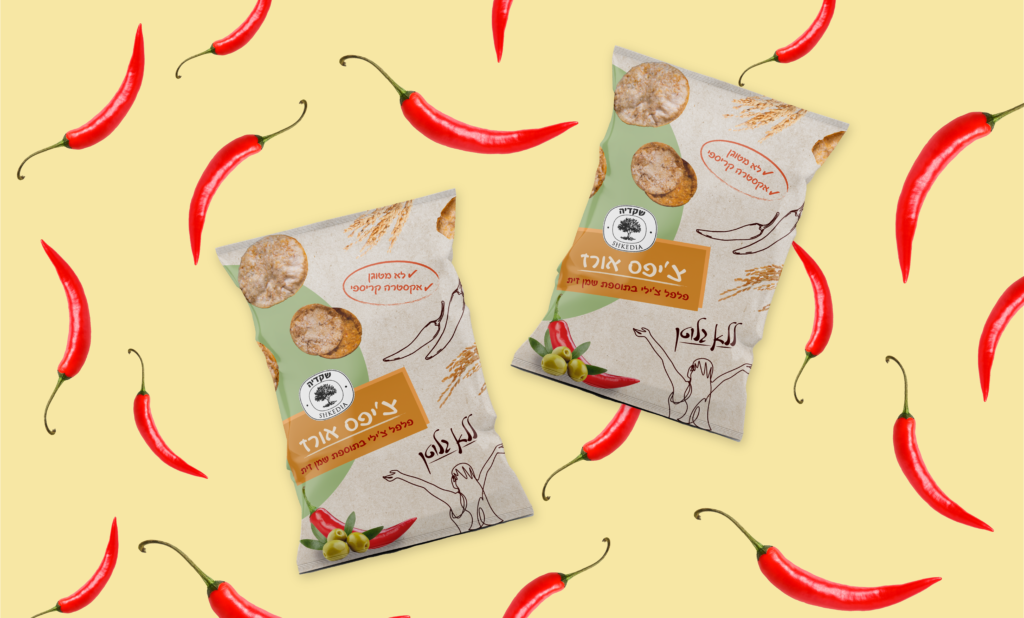
I chose to use the color green in combination with beige for the packaging design of the healthy rice crispies for a few reasons. Firstly, green is often associated with health, nature, and freshness, making it a great fit for a product that promises to be healthy and natural. By featuring green prominently in the packaging design, we are creating an instant association with health and wellness in the mind of the customer.
Additionally, beige is a neutral color that evokes a sense of simplicity, wholesomeness, and naturalness. This makes it a perfect complement to the green color scheme and helps to create a packaging design that feels both natural and modern.
Together, the green and beige color scheme creates a sense of naturalness, freshness, and simplicity that perfectly matches the product's unique selling proposition - healthy rice crispies that are good for you and the environment.