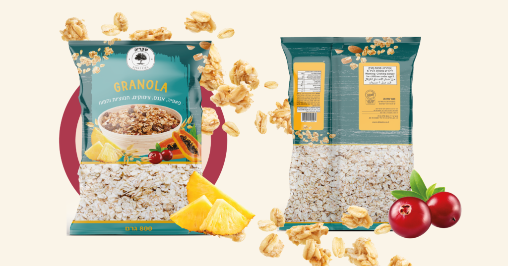
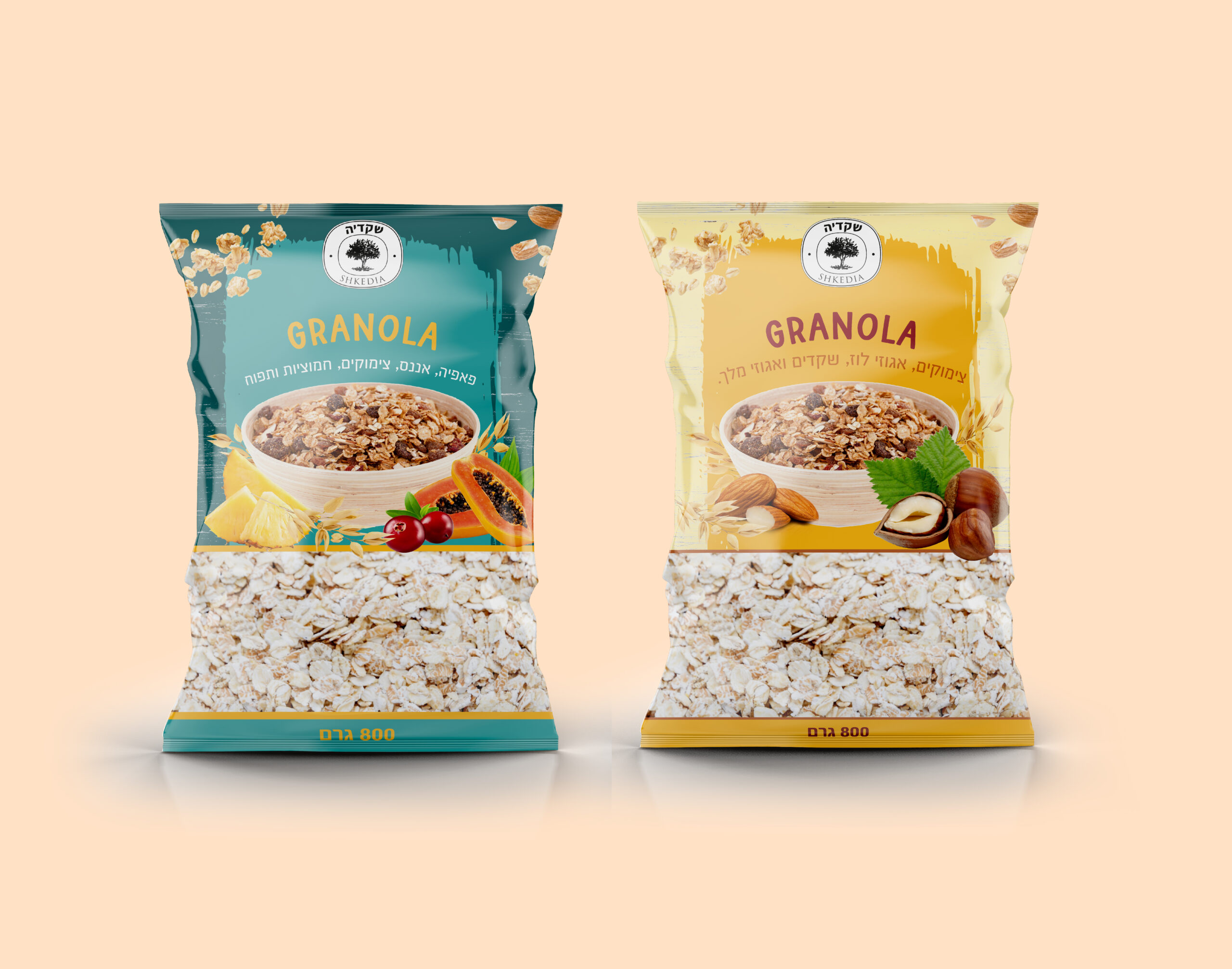
As the branding expert for Granola, I wanted to create a graphic language that would visually communicate the brand's focus on happiness and summery vibes. To achieve this, I used bright, cheerful colors such as yellow, orange, and pink that evoke feelings of warmth and happiness.
In addition to the color scheme, I used playful and dynamic illustrations of fruits, nuts, and other natural ingredients commonly found in granola. These illustrations not only visually communicate the product's ingredients but also evoke a sense of freshness, health, and summertime.
Overall, the graphic language I created for Granola is intended to communicate a fun, positive, and summery vibe that reflects the brand's focus on delivering a happy and wholesome snacking experience.