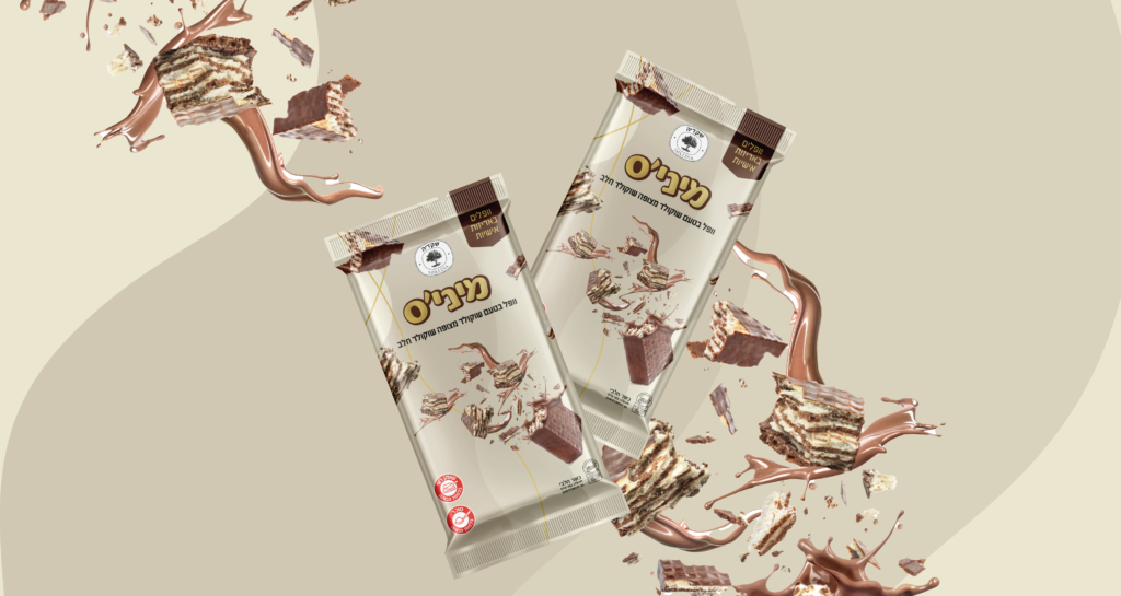
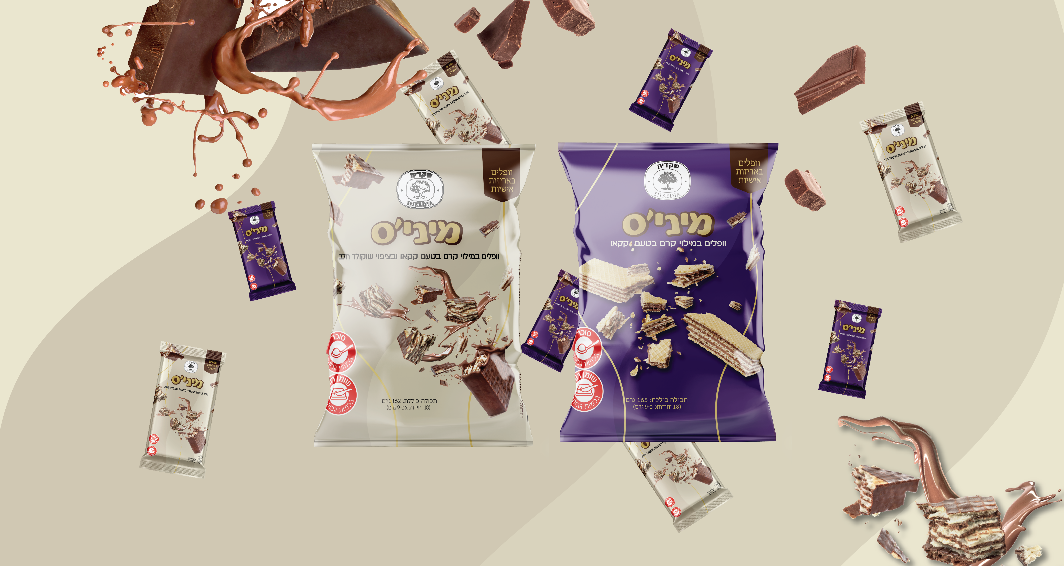
We chose to incorporate a tangible image of the product itself into the packaging design for waffles with chocolate because it creates an instant visual appeal and helps the customer understand what the product is all about. By featuring an image of the waffle with the chocolate filling oozing out, we are highlighting the product's key selling point - the delicious and indulgent filling.
Additionally, by featuring the product image prominently on the packaging, we are also helping the customer make a quick and informed purchase decision. This is especially important in the crowded food market, where customers are often spoilt for choice and need to make a quick decision.
Regarding the choice of colors, I chose beige and purple for a few reasons. Firstly, beige is a neutral and warm color that evokes a sense of comfort and coziness - perfect for a product like waffles that are often associated with comfort food. Purple, on the other hand, is a rich and indulgent color that is often associated with luxury and indulgence - again, a perfect fit for a product like waffles filled with chocolate.
Together, the beige and purple color scheme creates a sense of warmth, indulgence, and comfort that perfectly matches the product's unique selling proposition.