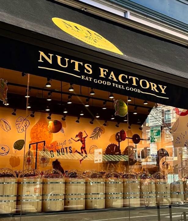
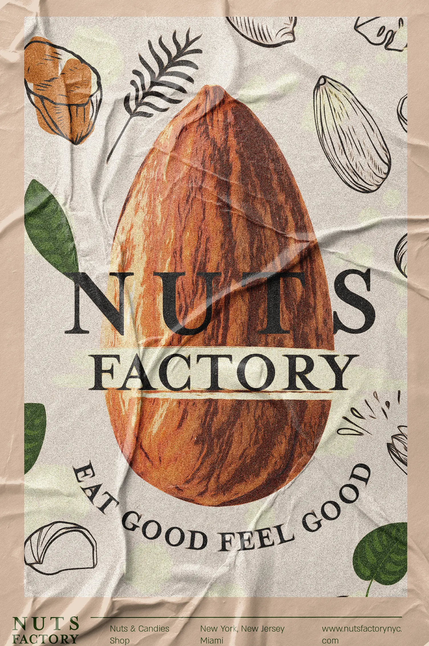
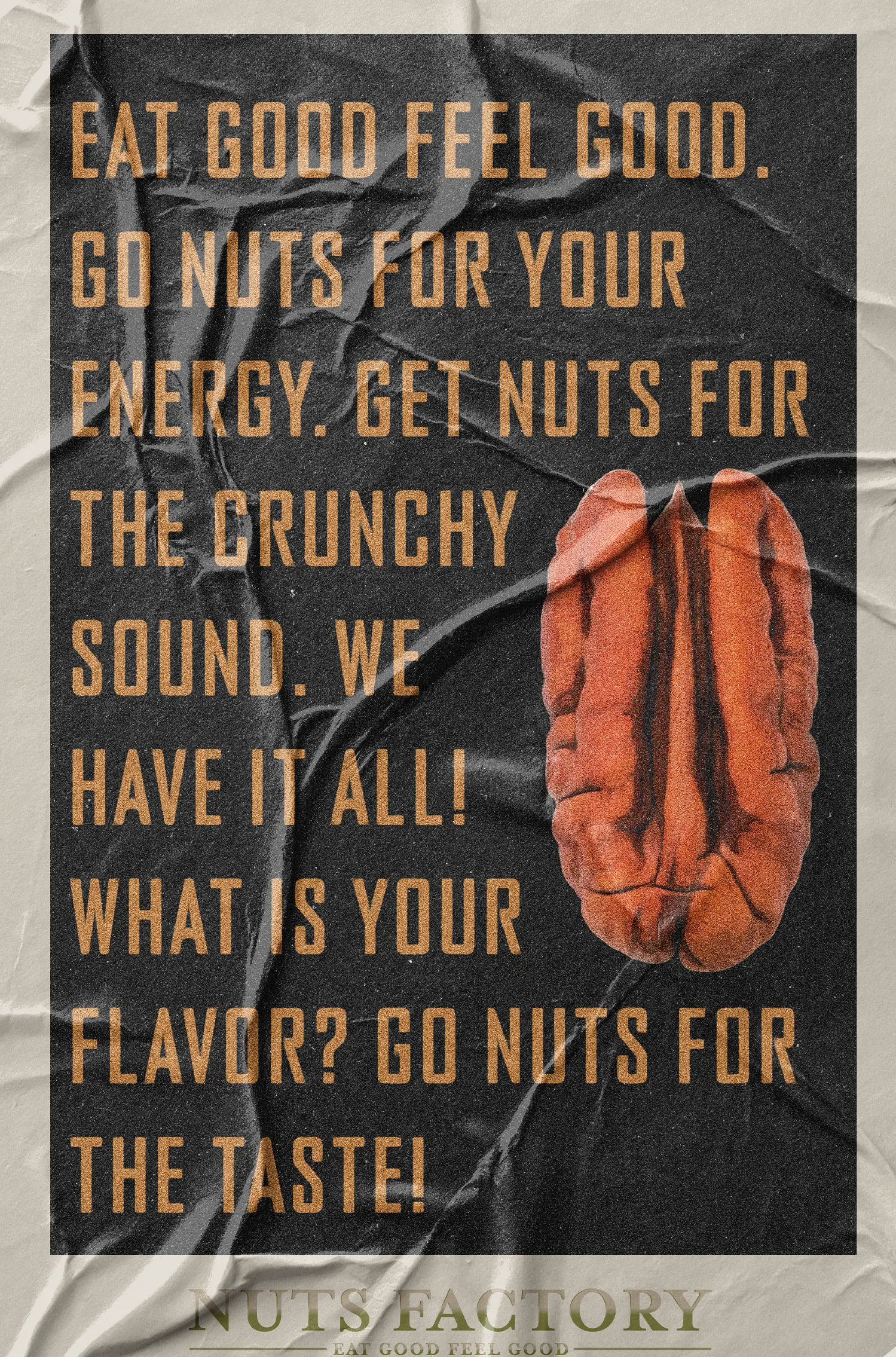
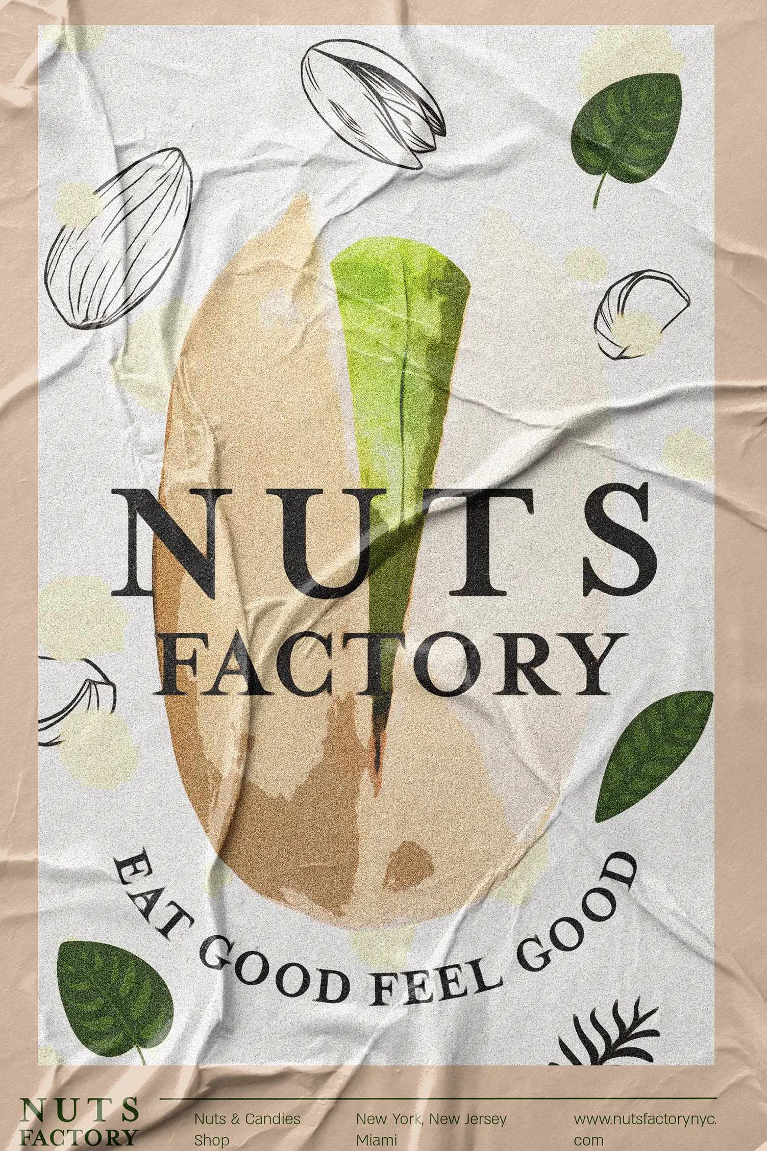
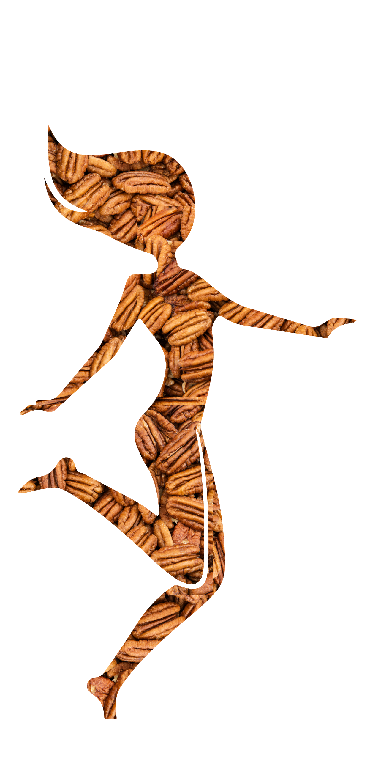
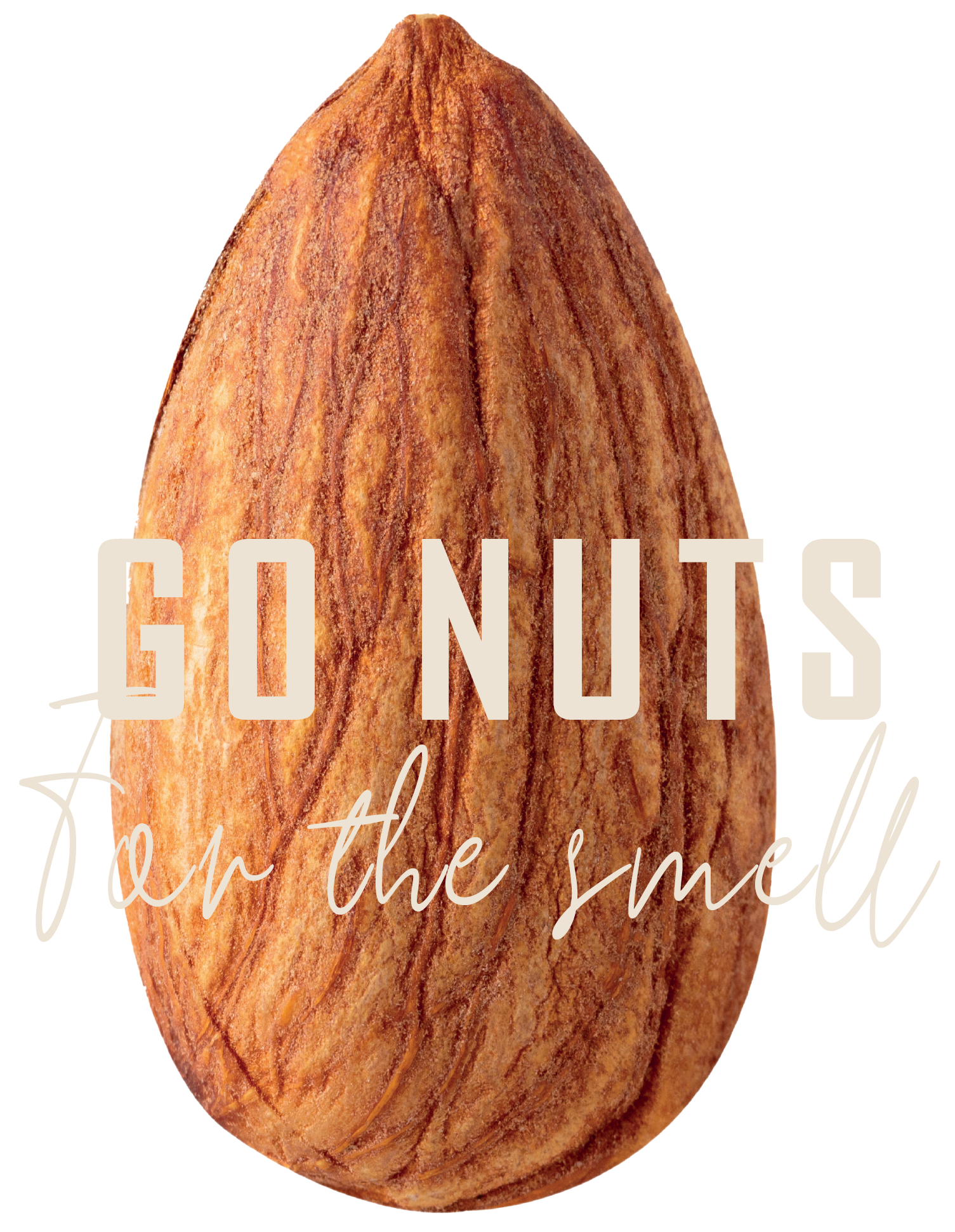
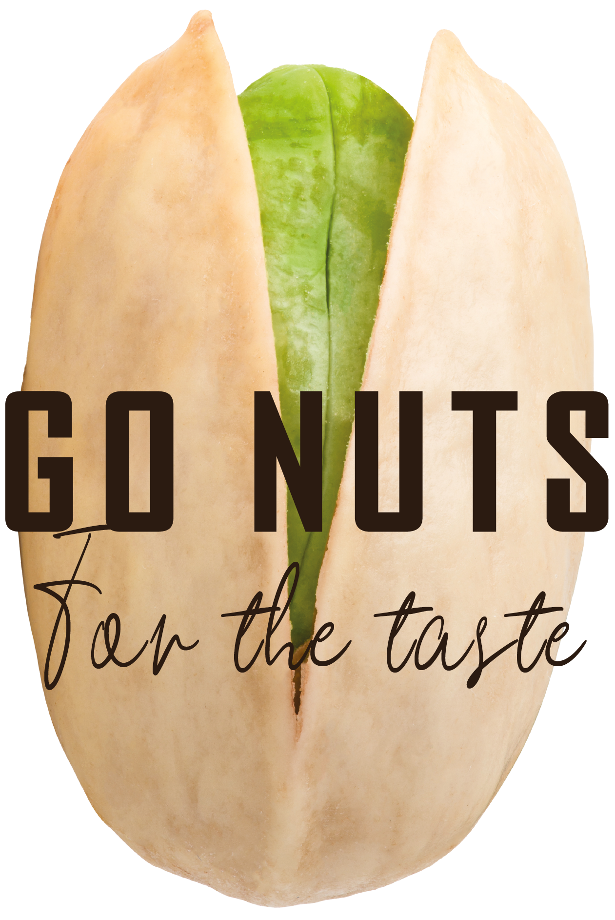
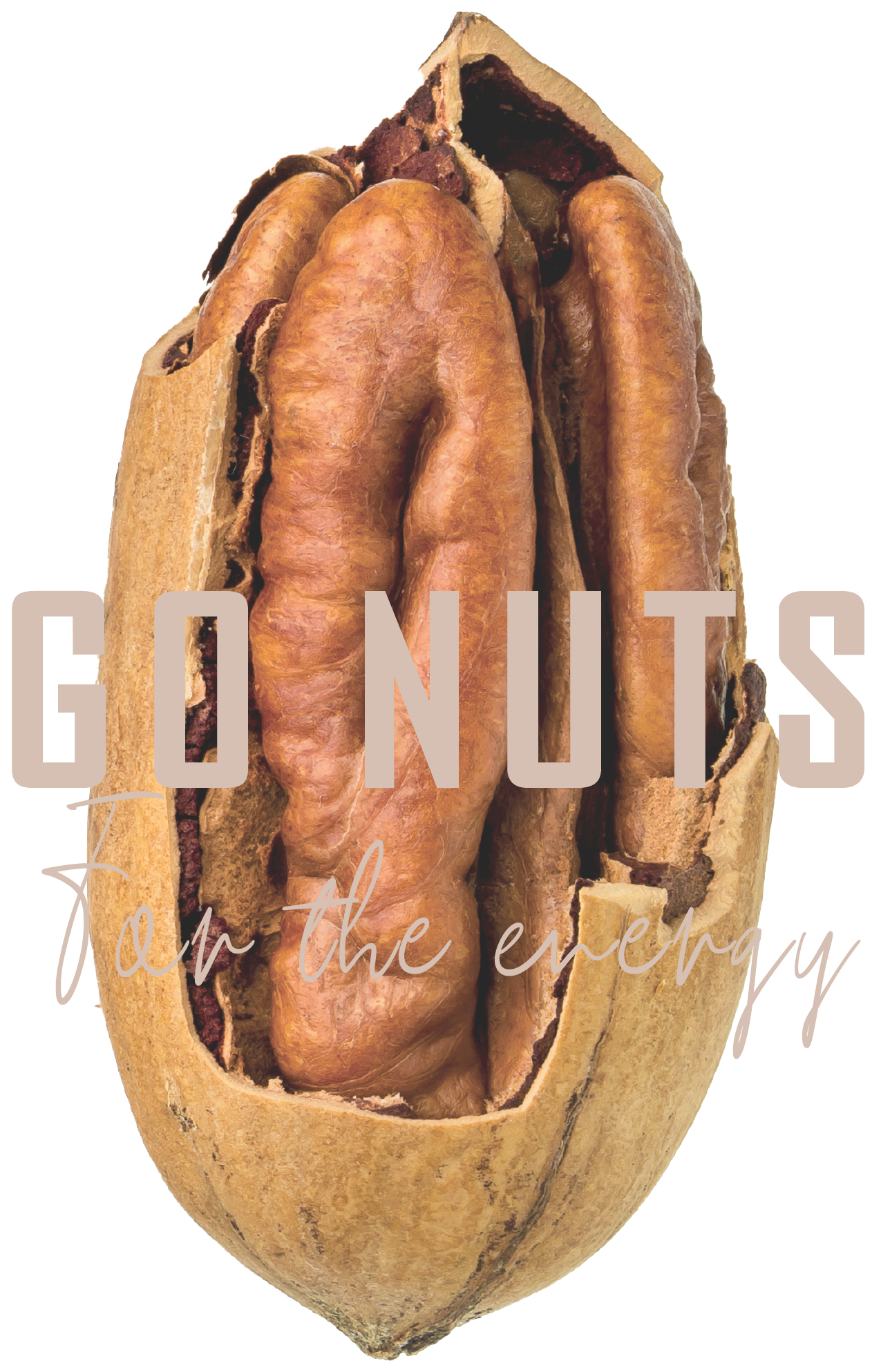
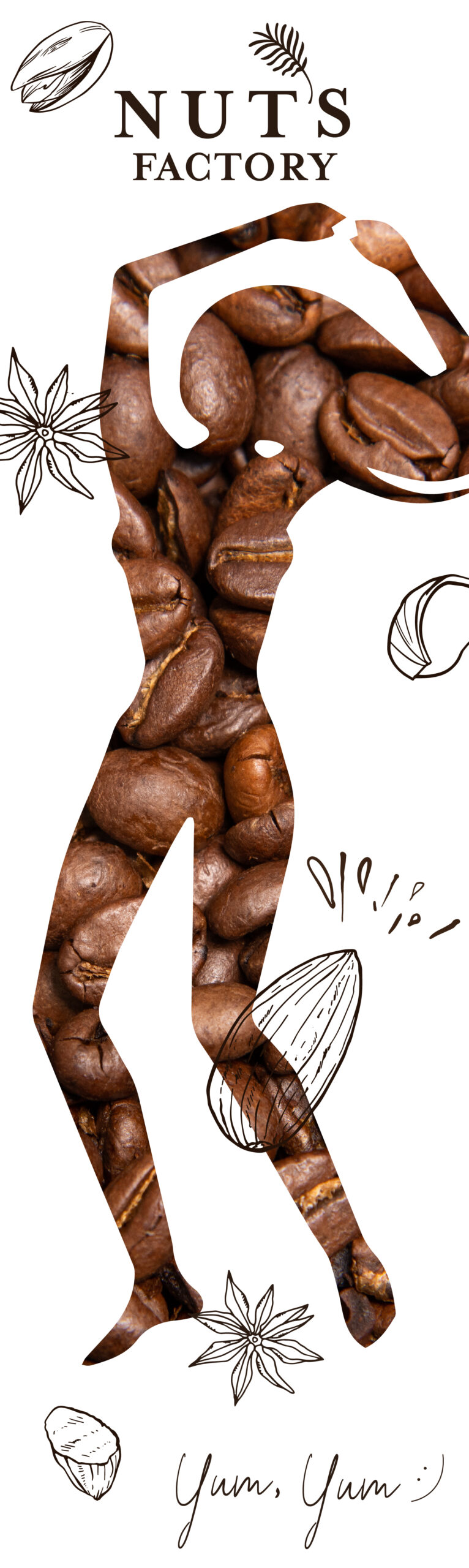
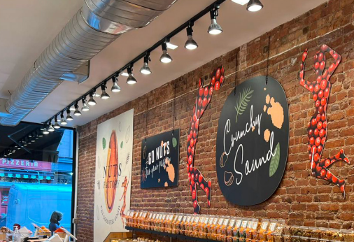
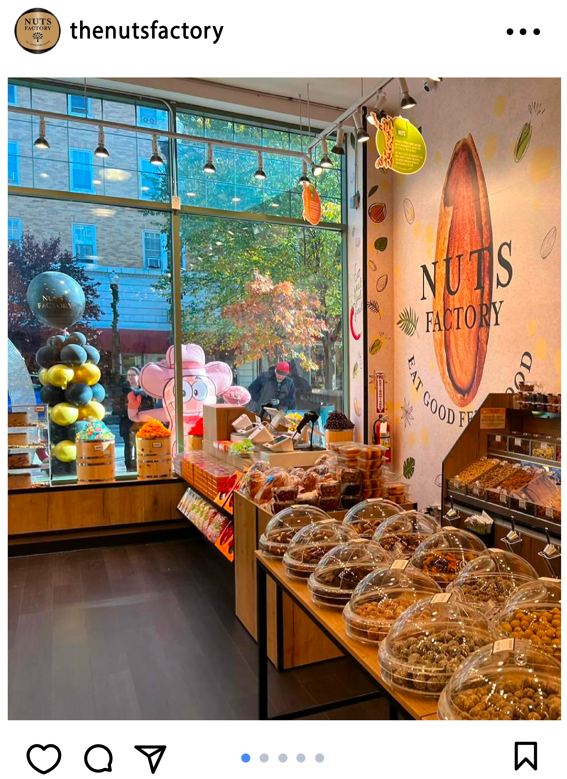
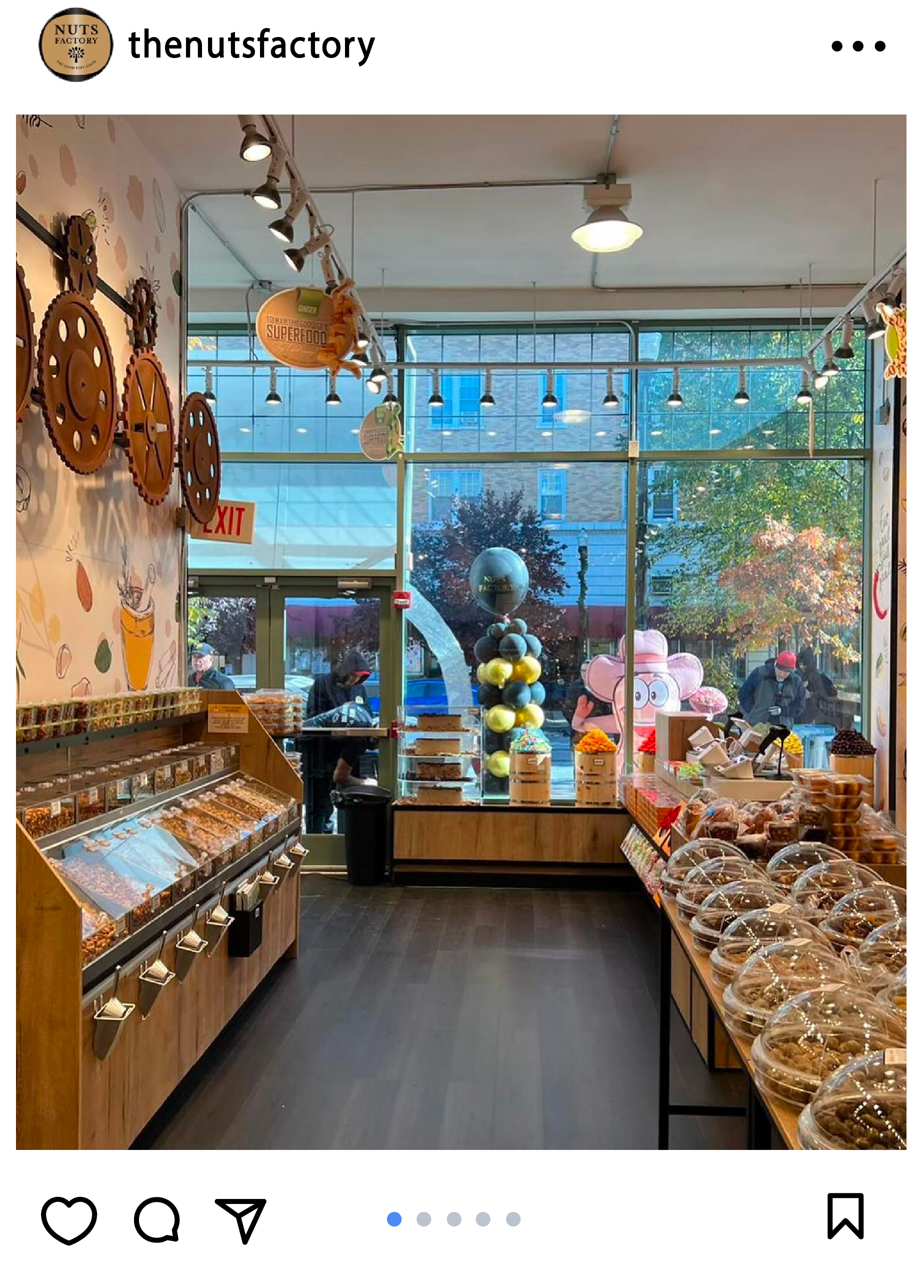
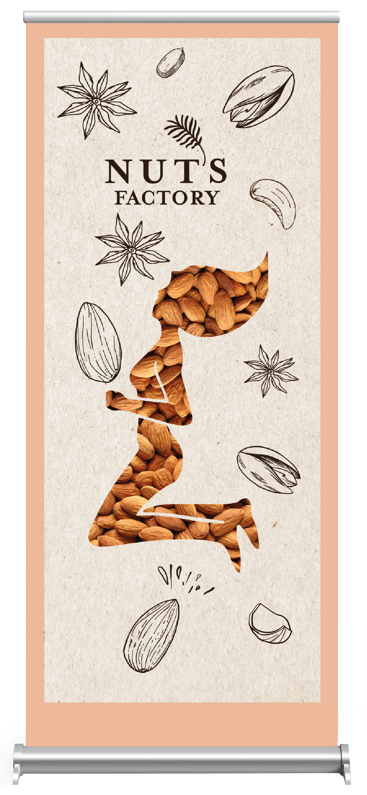
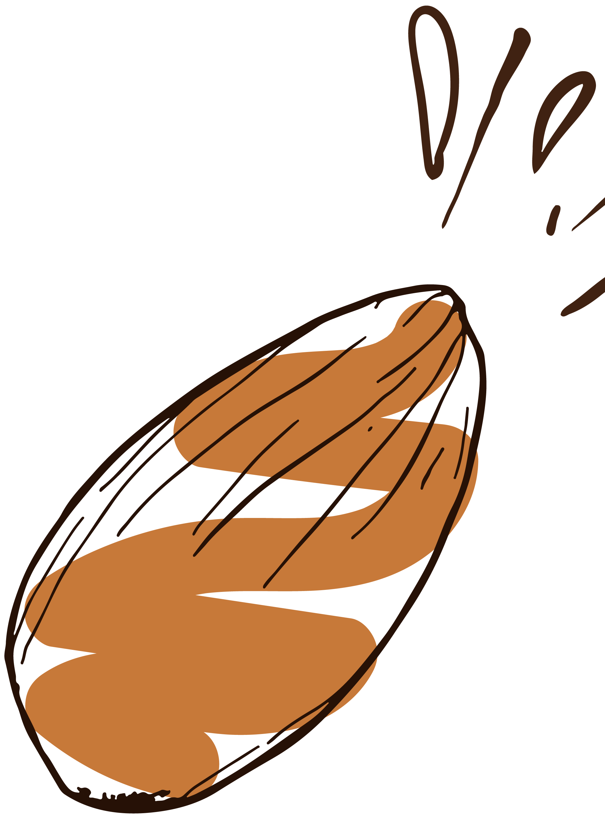
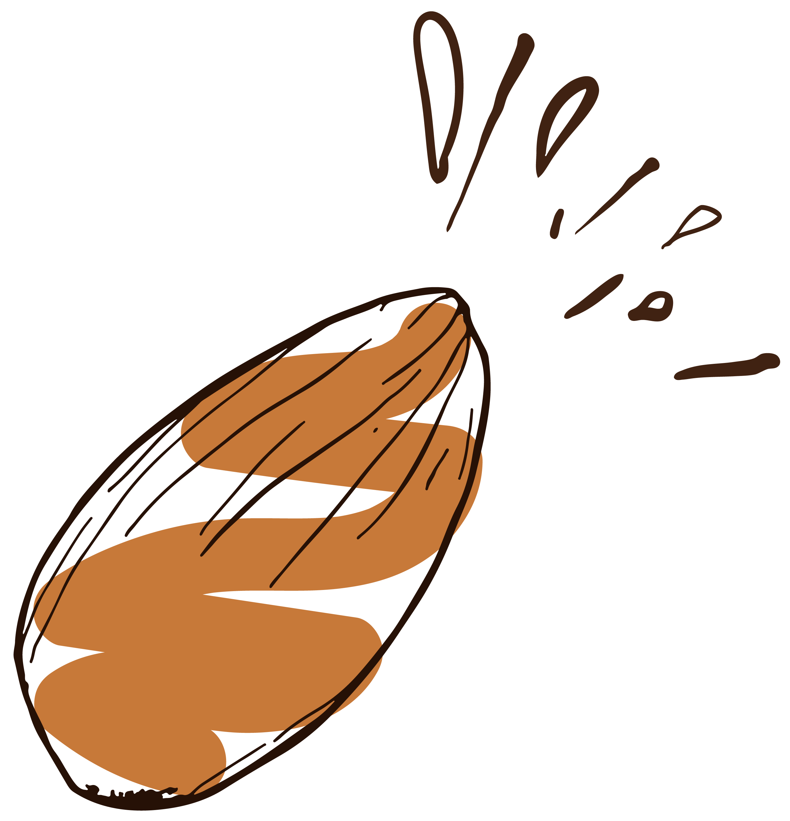
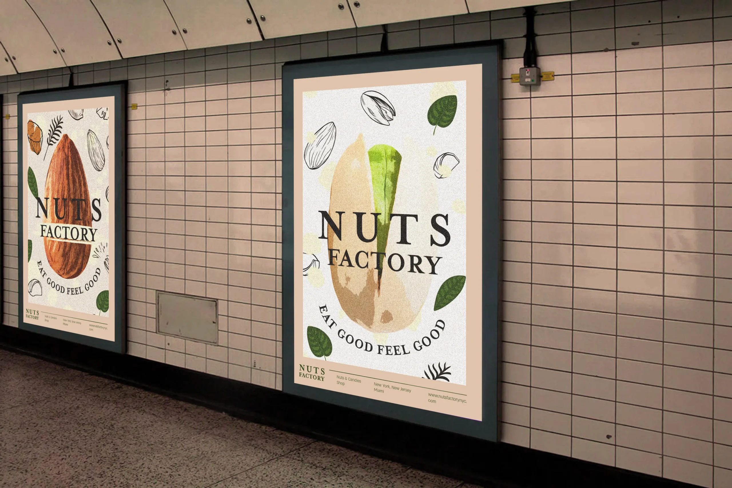
The rebranding process for the first nut store in the United States involved creating a visual identity that conveys warmth and approachability, along with incorporating natural elements to match the products. The chosen colors—brown, beige, green, and yellow—highlight the connection to natural and organic food, with an emphasis on brown to create a sense of homeliness and green to represent freshness and nature. The branding I created exudes a youthful, energetic, and vibrant atmosphere, inviting people to come in and explore the products. The warm and lively colors, combined with creative illustrations, generate a sense of joy and innovation, while maintaining a connection to the brand’s heritage and history. The branding is designed to convey openness and friendliness, while maintaining a modern and captivating look.